
Best ATS-Friendly Resume Format in 2026: 4 Resume Layouts Ranked from Best to Worst
We ranked four resume layouts by ATS friendliness and explain why single-column resumes usually outperform sidebars, graphics, icons, and skill bars for QA, software testing, and SDET applications.
If you are applying for QA jobs, software testing roles, or SDET positions in 2026, resume content is only part of the problem.
Formatting matters too.
A lot of candidates still underestimate how fragile resume parsing can be. Applicant Tracking Systems (ATS) are often much better at reading plain, linear text than design-heavy layouts with sidebars, icons, graphics, charts, or decorative skill bars.
That creates an awkward tradeoff.
The resumes that look the most polished to humans are often the ones machines understand the least.
To make that concrete, we reviewed four example resumes and ranked them from most ATS-friendly to least ATS-friendly. The examples are not QA-specific, but the formatting lessons apply directly to QA Engineer, Software Tester, Test Automation Engineer, and SDET applications.
Short answer
If your goal is ATS safety, use a plain single-column resume with strong role-specific keywords, clear section headings, and simple bullet points.
Here is the ranking from best to worst:
- Plain Test Manager / Integration Testing Specialist resume
- Rhoda Jackson pink resume
- Simon Michaels yellow/black resume
- Michael Harris blue sidebar resume
ATS ranking table
| Resume | ATS friendliness | Why it ranks here | Main risk |
|---|---|---|---|
| Plain Test Manager / Integration Testing Specialist | High | Single column, clean hierarchy, readable bullets, no graphics | Very little formatting risk |
| Rhoda Jackson pink resume | Medium | Still text-based with recognizable sections | Two-column parsing can mix content |
| Simon Michaels yellow/black resume | Low | Includes text, but adds icons, stars, visual ratings, and heavier layout styling | Skills and sidebar content can be parsed out of order |
| Michael Harris blue sidebar resume | Very low | Visually attractive but structurally complex | Sidebar, photo, icons, and skill bars can cause heavy parsing loss |
1. Plain Test Manager / Integration Testing Specialist resume
Most ATS-friendly
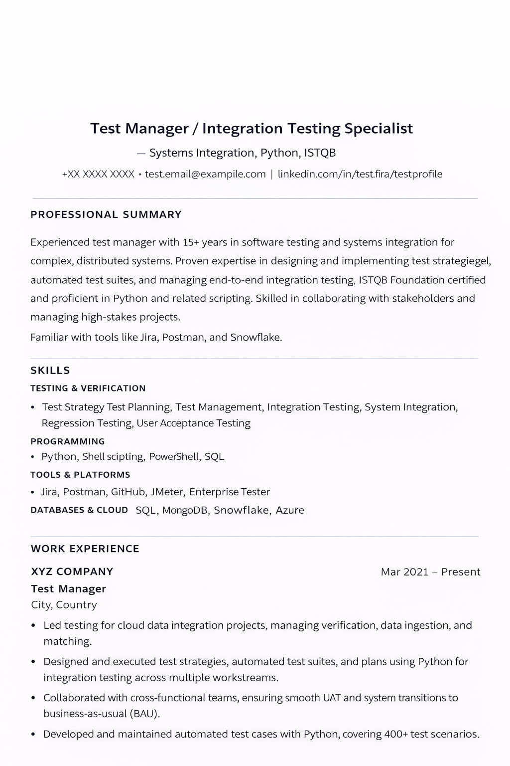
This one wins clearly.
It uses the format ATS software is most comfortable with: one column, normal headings, simple bullet points, standard job titles, and readable date placement.
Why it works:
- the document flows top to bottom in one reading order
- section labels are explicit: Professional Summary, Skills, Work Experience
- keywords appear as plain text instead of graphics
- tools, technologies, titles, and dates are easy to extract
This is close to the safest structure for QA and software testing candidates too.
If you are applying for QA jobs, the same format works well for testing-focused keywords such as Playwright, Selenium, Cypress, API testing, regression testing, test automation, CI/CD, defect tracking, and SDET.
2. Rhoda Jackson pink resume
Moderately ATS-friendly
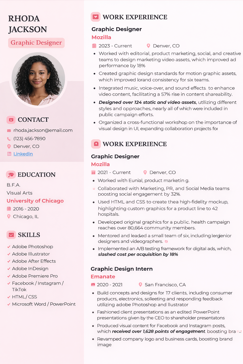
This layout is still readable enough that many modern systems will extract a lot of the content.
But it introduces a real risk: two-column parsing.
Many ATS tools do not reliably read one column and then the next. Instead, they read across the page, which can merge sidebar content into the main experience section or scramble the order of skills, education, and job history.
Why it still performs better than the next two examples:
- most of the information is still real text
- headings are visible and logically separated
- the design is lighter than the more graphic-heavy resumes below
Why it is still risky:
- the left sidebar can be read out of order
- icons add noise without helping ATS extraction
- contact, skills, and education may be blended into nearby sections
For many candidates, this is the kind of resume that feels “safe enough” but is still less reliable than a plain single-column version.
3. Simon Michaels yellow/black resume
Low ATS friendliness
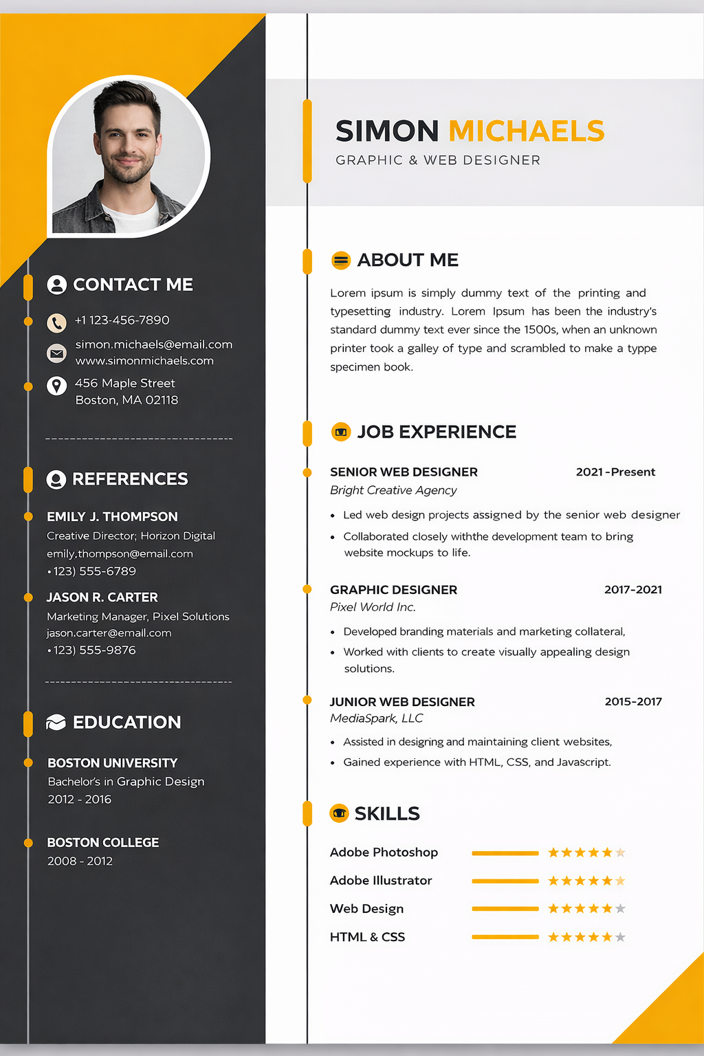
This is where design starts to work directly against parsing quality.
The resume includes multiple ATS hazards at once:
- two-column layout
- decorative visual structure
- icons
- photo
- skill ratings shown as stars and bars
The problem with visual skill scales is simple: ATS systems do not care that a row of stars looks polished.
They care whether the text next to it can be extracted cleanly and associated with the right skill. In many cases, the resume will still capture “Adobe Photoshop” or “HTML & CSS,” but the rating signal itself becomes meaningless or noisy.
For QA and SDET candidates, the equivalent mistake is using fancy charts for:
- Selenium proficiency
- Playwright proficiency
- API testing skill level
- Java, Python, or SQL comfort
If the skill matters, write it as plain text in context. Do not hide it inside a visual meter.
4. Michael Harris blue sidebar resume
Worst for ATS
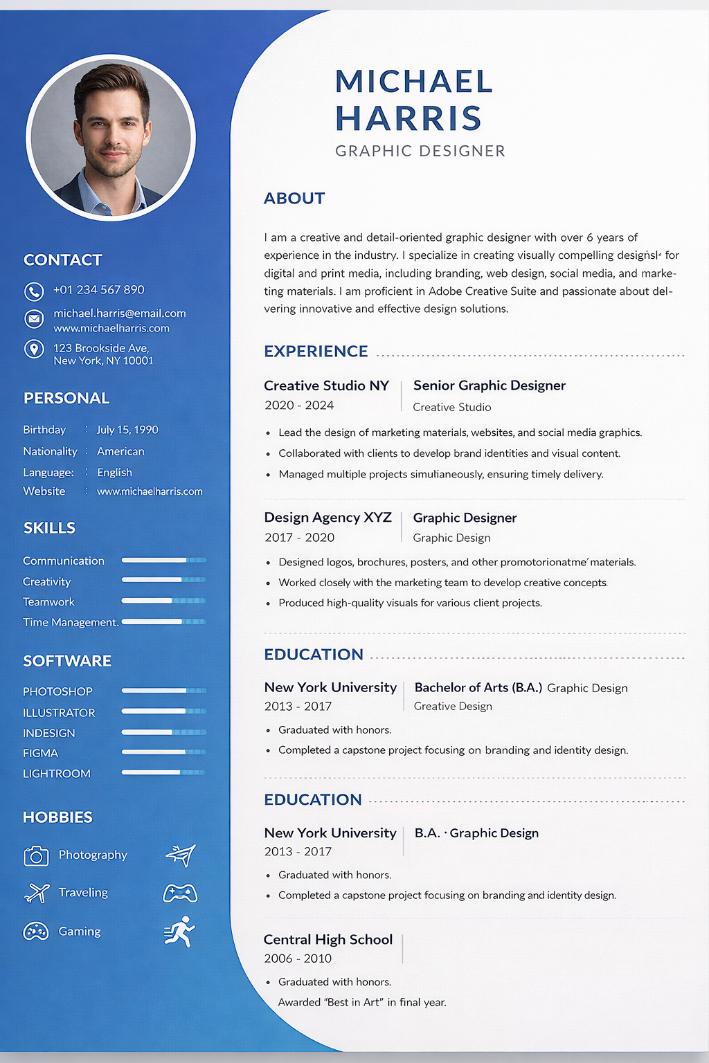
This is the strongest visual design of the four.
It is also the weakest machine-readable format.
The layout stacks several common ATS failure points into one document:
- photo
- heavy sidebar structure
- icons
- progress bars
- visually segmented personal details
- multiple decorative sections competing for reading order
In some ATS systems, the parser will still recover fragments.
But fragments are not enough.
If contact details, skills, section boundaries, or work history become partially detached from one another, the resume can look incomplete or low-confidence inside the employer’s system even when the original PDF looks excellent to a recruiter.
This is the kind of design that often loses to a simpler resume before a human review ever starts.
Why ATS systems struggle with visual resumes
ATS software is not reading resumes like a human designer or recruiter.
It is trying to identify fields, entities, keywords, dates, titles, locations, and experience blocks in a predictable order.
That is why the following design choices create risk:
- sidebars split the reading order
- icons replace or interrupt plain text cues
- photos add non-essential visual elements
- charts, stars, and bars turn skills into graphics instead of text
- multi-column designs increase the chance of section mixing
Think of an ATS as a robot reading with a ruler.
The straighter the text flow, the better the outcome.
What QA and SDET candidates should do instead
If you want a safer resume for software testing roles, keep the format boring and make the content stronger.
That means:
- use one column
- use clear headings like Summary, Skills, Experience, Projects, Education
- keep dates, titles, and company names easy to scan
- write tools and testing skills as plain text
- match the language of the job description where it is honest and relevant
- remove decorative ratings, photos, and unnecessary graphics
Then focus on the part that actually improves interview odds:
- better role targeting
- better keyword alignment
- clearer evidence of impact
- stronger examples of testing scope and ownership
That is where tools like the Application Workspace and AI Resumes are more useful than resume decoration. One helps you see job-fit and missing signals. The other helps you tailor the resume to the target role without rebuilding the whole document from scratch.
The real hiring-tech paradox in 2026
There is a small paradox in modern job searching.
Some employers now use two machine layers:
- an ATS that prefers simple formatting
- an AI summarizer or downstream reviewer that prefers rich, specific, metric-driven content
The answer is not to make the resume more visual.
The answer is to keep the format simple while making the content denser with real evidence:
- what you tested
- what tools you used
- what risk you reduced
- what systems you supported
- what outcomes you improved
That balance gives both systems something useful:
- the ATS gets clean parsing
- the AI layer gets specific, structured signal
Recommended workflow for QA resume optimization
If you are applying to testing roles now, this is the practical sequence:
- Start from a plain single-column resume.
- Compare it against the target role in the Application Workspace.
- Tailor the wording in AI Resumes so your testing tools, scope, and impact are easier to match.
- Build stronger role-specific talking points with PAKit in the Application Workspace.
- Apply only after the content and the formatting are both working for you.
That approach is usually better than spending hours polishing visual resume design.
Related reading
FAQ
Are two-column resumes always rejected by ATS?
No. Some modern systems can parse them reasonably well. The problem is not that they always fail. The problem is that they fail more often than plain single-column resumes.
Are photos and icons always bad for ATS?
They are usually unnecessary and often risky. They rarely improve parsing and can make the layout noisier for extraction.
Do skill bars and star ratings help with ATS keyword matching?
Not really. ATS tools care much more about clean text than visual ratings. Write the skill in plain language and show it in your experience bullets instead.
What is the safest resume format for QA jobs?
A single-column resume with clear headings, standard text, strong testing keywords, and simple bullets is usually the safest option for QA Engineer, Software Tester, and SDET applications.